Shape Fit
Mobile App Design, UXR, UX Design, Design Systems

People at all stages of life have various reasons for wanting to become more active. However, if you’ve ever stepped into the gym after a long time away or have tried any workout after not exercising for some time, it can be easy to feel embarrassed, intimidated, or even angry at yourself and your workout ability. Although many people are motivated to workout for a variety of reasons, staying committed can be difficult.

For this project, I chose to follow the double diamond model. The first diamond consists of determining user needs and narrowing down these needs to the most important need (user research, the problem).
With the most important user need identified, the second diamond explores different solutions, narrowing down the list of solutions to the most compelling solution, and consequently ideating, prototyping, and testing it (ideations, the final design).
I conducted secondary online research, pulling information from popular fitness apps like Sweat, FitOn, FitnessView, and online community forums centered around working out and exercise via Facebook, Reddit, and Youtube comment section of various fitness youtubers. Targeting comments about the motivations and frustrations of exercising and/or getting back into an exercise routine, I found that many individuals:
Due to my familiarity with individuals in their 20s, I chose this demographic to be the target audience, and I created two user personas that captured the most common stories found online of this audience.
One interviewee hypothesized that because they 'Like' most videos on their ‘For You’ Page and use TikTok frequently, finding videos can be especially stressful and frustrating: [The experience of scrolling] "takes a long time, [eventually I became] too tired [and had] no choice but to give up."
The first persona is Bree. She is a busy college student in her early 20s who wants to look good like the people she often sees online and just feel more confident in her body overall.
.png)
The second persona is Ryan. Ryan works at an office as a full time employee and plays games in his free time. Despite being in his mid-20s, he has mild back pain because he often sits for long periods of time. He heard that exercise helps reduce pain, so he’s been thinking about incorporating more exercise into his daily routine.

I created six storyboards depicting common reasons people may choose to exercise. With these storyboards, I interviewed 3 individuals within the target audience and asked them to describe their relationship and experience with exercise, and if they resonated with the scenario depicted in the storyboard.


Users empathized with Scenarios 1 and 2 the most, resonating with the protagonists and the pressure placed on individuals in our current diet and fitness culture and agreeing upon the importance of having individuals to support on one's exercise journey. As Interviewee #1 mentioned specifically, “I think that having friends and other people to make you exercise and hold you accountable makes things a lot easier in the long run. Having people there for you is always good practice.”


I conducted a market study of three prominent fitness apps (FitOn, Sweat, and Fitbod Workout and Fitness Plan). These apps had millions of downloads combined and had many strengths such as a wide selection of exercises (from beginner to advanced) and an option to send the user notifications to exercise at certain times of day or on certain days. However, these apps also frustrated users because it was difficult to find features, and there was no way to disable or hide certain features. Furthermore, the exercises suggested by these apps did not connect to an overall exercise goal.

Individuals in their 20s want to build healthy exercise habits for a variety of reasons (body confidence, appearance, strength, energy and focus at work, pain reduction, etc.). But no matter how strong these motivators are, it can be difficult to stay motivated and consistent without a community and source of accountability to support them.
With all aspects of user research in mind, I found room for opportunity to design an app that could better address user needs by:
I chose to take the pen and paper route, sketching ideas of how the different pages of the app could incorporate the above solutions. Below shows an example sketch for each page.

With these sketches giving me an idea of how I wanted each page to start, I began adding more details and creating low fidelity wireframes to fill out the app more.

Moving on to prototyping and testing, I interviewed 3 individuals for 45 minutes to evaluate if the interviewees were able to accomplish the task given (and if so, with how much or little difficulty) and to determine if any portions of the app needed changing to improve user performance and satisfaction.
Based on their feedback and my observations of their ability to handle the task, I modified the prototypes to better match user expectations to the actual design and to include additional details to make the features provided more clear.

How did I want users to feel while using the app? I wanted users to feel empowered, encouraged, confident, and to be excited for their next workout. The color blue is associated with being trustworthy, dependable, and committed. The color orange is associated with enthusiasm and encouragement. These two colors and their shade are primarily used in Shape Fit.
I used Asap as the header and paragraph text font, and Work Sans as the subheader. Asap is a sans-serif font that is more readable. Work Sans is a serif font that works well in a header or subheader position, and since the size of the subheader text isn’t too small on mobile devices, I chose Asap and Work Sans together to provide visual contrast.

I also wanted users to understand visually the app’s goal of providing workouts that fit their routine. Because each user’s workout routine is unique to themselves like a puzzle, Shapefit’s logo was designed to look like a puzzle, with separate, distinct pieces (various exercise videos) adding together to create a whole (the user’s ideal fitness routine).
Combining the style guide with the feedback received during low fidelity usability testing, I created the high fidelity wireframes.
I interviewed the 3 individuals again once more observing if there was anything particularly frustrating or enjoyable about the page or task given and evaluating if the contents of each page matched their expectations or if the content needed to be modified.
In this round, feedback was less focused on the UI of the tool, and more focused on additional features that could be beneficial. Based on their feedback, I modified the design again.

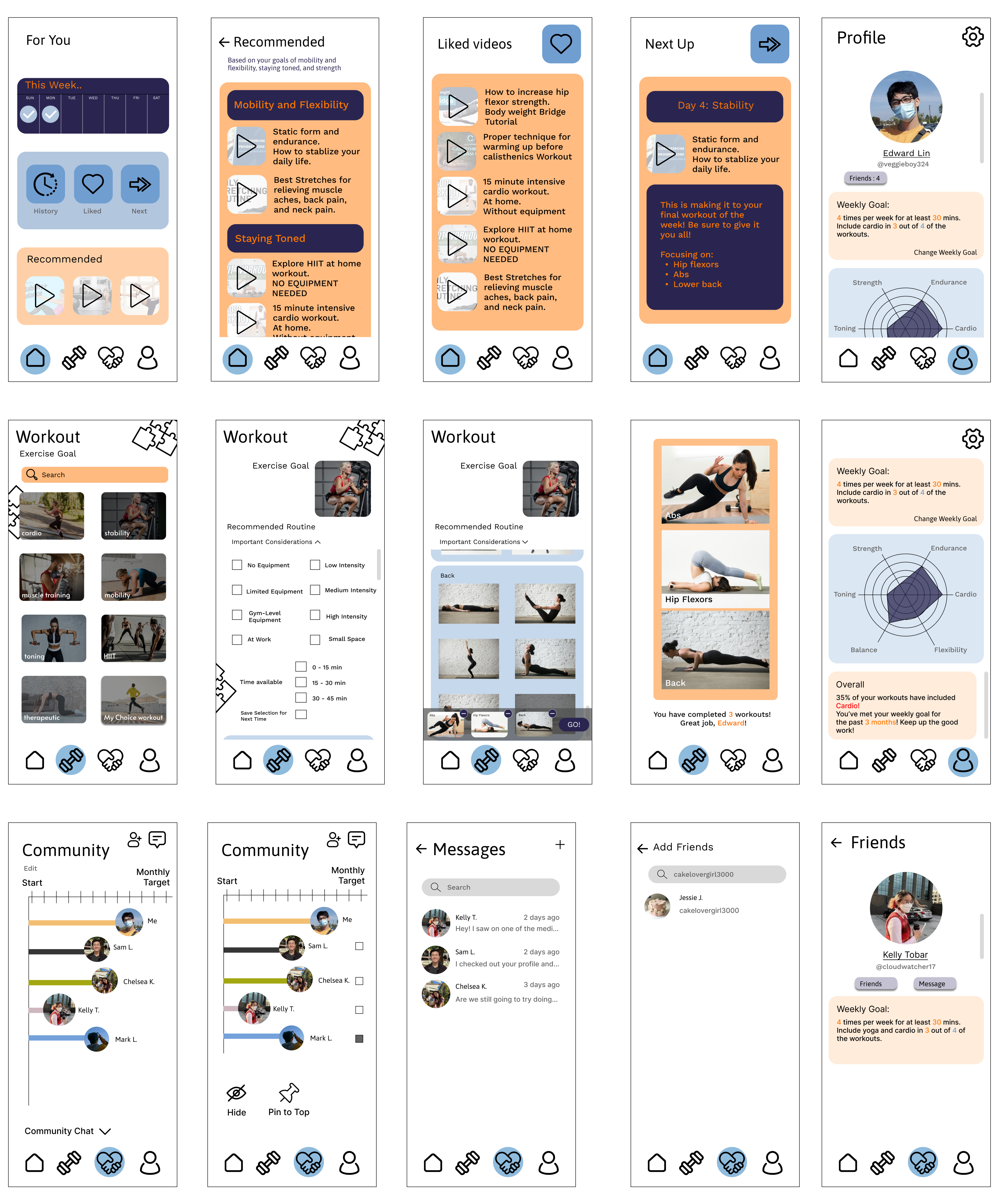
To start, users will login to the app and make their account. As they make their account, they will be asked to define their fitness goals, how frequently they want to exercise, and their experience level (this can be changed later). Upon completion, users will be brought to their home page (called ‘For You’), where they can view (and track) their exercises for the week, their most recent exercises, their liked exercises, and their next workout (recommended by the app).


If users want to create a workout instead of relying on their ‘liked’, most recent, or recommended workout videos, users can create their own workout using the Workout page. On this page, users will be guided by our app to select three exercises based on their chosen goal and other considerations (e.g. space available). Users also have the option to create their own workout and select from all exercises available on our app using the ‘My Choice workout’ option.


The ‘Community’ page has a lollipop chart and displays how the user and their friends have progressed on their fitness goals for the current month. Users have the option to chat with everyone on their chart, remove certain friends from showing on their chart, pin a certain friend to the top of their chart, or send a group message by selecting friends on their chart. Only friends (users the individual follows and is followed by) appear in the user’s ‘Community’ page.


By tapping on a friend’s picture, users can also use the ‘Community’ page to pull up their friend’s profile or message them directly.


Users can use their profile page to not only manage their account, edit their weekly exercise goal, see their own fitness profile, and read statistics about their exercising habits, but to also view their friends on the app and invite friends to join Shape Fit.

.png)
This project taught me the importance of getting the right design, instead of getting the design right. Originally, I was really excited by the idea of the mandala showing one’s progress. I loved the symmetry and how it could grow as you progressed and how the different colors could show what you worked on. But when users found it confusing, I ideated something completely different. This project taught me that I should focus on what the best design is for users.
There are a bunch of features that I would like to have added to Shape Fit. My highest priority would be to add a way to save a set of workout videos to one’s ‘Home’ and/or ‘Profile’ page for easy retrieval. During high fidelity interviews, one interviewee suggested the ability to share custom workouts with friends and show these workouts on one's profile page, similar to Spotify and how an individual’s Spotify playlists can be made visible on their profile. Another feature that I would like to add is allowing users to plan an exercise and schedule it for another day in the future, editing the recommended ‘Next up’ exercises, and allowing users to schedule their workouts to repeat on a certain schedule.
The journey to wellness, whether one chooses to focus on the mental or physical side (or both), requires more than motivation, but a sense of community to succeed. Everyone has their own challenges, and in an age where it is easy to get discouraged on social media and its constant comparisons, we must rely on each other for a little kindness and some friendly competition.

Thanks for checking out my portfolio, which has just a few samples of my work. If you'd like to talk more about my process or see more, I'd love to discuss over the phone or in person.
