Tiktok Redesign


Who doesn't enjoy receiving a funny, relevant, and interesting video from a friend? Oftentimes, it's these types of videos that keep friendships alive, especially in situations when your friend lives a 5-hour flight away from you.
TikTok is a popular social media platform for video creation and sharing, however its growing popularity means not only more users, but also more content to search through.

For this project, I chose to follow the double diamond model. The first diamond consists of determining user needs and narrowing down these needs to the most important need (user research, the problem)
With the most important user need identified, the second diamond explores different solutions, narrowing down the list of solutions to the most compelling solution, and consequently ideating, prototyping, and testing it (ideations, the final design).
I interviewed 18 individuals in their late teens and early twenties. Interviewees had varying familiarity with Tiktok, with 2 users never having used TikTok previously and 3 users describing themselves as 10/10 in terms of familiarity with Tiktok.
I gave them three tasks:
Interviewees mostly completed the 3 tasks given, however many of them struggled to find a video that they wanted to show me or the sample video that I asked them to ‘Like’. For task #3, 15/18 interviewees struggled to find part 2 of the video, with some completely skipping over the video and scrolling twice to find it, while others scrolled slowly through the Creator’s page and questioned the video’s existence. 5/18 interviewees gave up on the task after struggling for a few minutes.
One interviewee hypothesized that because they 'Like' most videos on their ‘For You’ Page and use TikTok frequently, finding videos can be especially stressful and frustrating: [The experience of scrolling] "takes a long time, [eventually I became] too tired [and had] no choice but to give up."

Despite their familiarity with TikTok, many users struggle to find specific videos on another TikTok Creator’s page to share with their friends and family, leading to a frustrating and stressful experience that causes many users to simply give up on sharing videos.
I created two design spaces to display tradeoffs between existing designs (e.g. market competition), the ideal design, and designs that might provide inspiration. I included similar video sharing social media platforms such as Instagram, Twitter, Youtube, the ideal design, and where our redesign may be expected to fit.
Since most users struggled finding videos despite the amount of information shown on a TikTok Creator's page, I chose to contrast functionality with the intuitiveness and simplicity with usability.


Based on the two design spaces and most painful user problems, I focused on ideating two solutions:
In the first round of ideations, I considered adding title cards to the video thumbnail or increasing the thumbnail contrast of a ‘Just Watched’ video, but I decided not to as it would take away from the creative agency of users and add more clutter to the current layout. I also considered adding heart icons to show when you’ve liked a video on a Creator’s page but decided against it as it would make the video thumbnail more cluttered.


Instead of showing a user's 'Liked' videos on the TikTok Creator's page, I switched focus to modifying the home layout of the User's Profile Page to organize their ‘Liked’ videos into playlists of their own creation. These new playlists can be seen under the playlist icon.

Additionally, during our interviews, I learned that many of our participants were frequent users of Youtube and enjoyed watching videos on their platform. Taking advantage of this familiarity, I pivoted towards allowing viewers to press down and hold on a TikTok video to watch the first 3-seconds of the video (similar to how Youtube allows their users to preview videos).
.png)
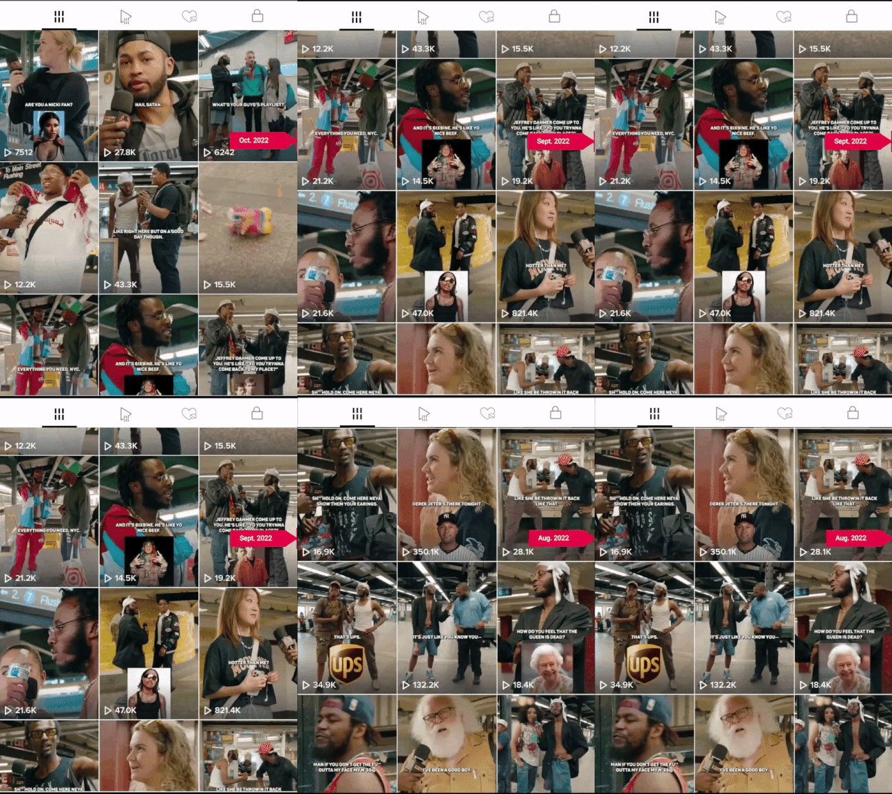
Lastly, during user interviews, I found that five of eighteen interviewees took advantage of the date of the video to find the second part of the video (some successful, others unsuccessful). Rather than making the 'Just Watched' card more contrasting, I focused on adding a timeline that would allow users to see the month and year a certain TikTok was posted as they scroll through a TikTok Creator's page.

Being one of my earliest projects, this project instilled in me the importance of user research in the design process. Being a frequent user of TikTok myself, I had my own preconceptions of what needed to be fixed. Keeping an open mind and interviewing others allowed me to get a more general understanding of what the primary problem was that users were facing, which allowed me to ideate different solutions than what I had originally expected. In short, it allowed me to better understand the root of user frustrations and focus on that, rather than on my own frustrations (mere symptoms of that larger user frustration).
Unfortunately, I was unable to get user feedback on the final redesign, so if I had more time to continue working on this project, I would survey users to see if our redesign did alleviate their issues. Furthermore, since I have completed this project, TikTok has updated its organizational structure to allow TikTok creators to make playlists of their own videos and to allow viewers to make playlists of the videos that they want to save. However, TikTok has still not implemented a date scroll bar, so I believe that user testing of my team's redesign could still be beneficial.
In this age of information where attention is money, being able to easily and quickly find videos is a must. Not only because finding videos easily will allow users to continue connecting with each other and sharing videos, but as social media continues to increase its usership and influence on the younger generation, the use of social media for other purposes besides entertainment and for educational purposes or the spread of relevant news may become more common and acceptable way of sharing news in the future.